Gallery Wall Ideas: Layouts Spacing and Templates That Work
A gallery wall works when the spacing stays consistent and the layout is planned before a single nail goes in. Keep frames about 2 to 3 inches apart, center the arrangement at eye level, and test it first with paper templates. The seven layouts below fit living rooms, hallways, and bedrooms, and most take about an hour to plan and hang. You need no special tools beyond a level, some paper, and painter’s tape, and the layouts work on any blank wall, from a narrow hallway to a wide living room.
A blank wall is the easiest surface in a home to ignore and the hardest to finish. You walk past it every day, and yet every plan stalls at the same question: where does the first frame go?
A gallery wall is not a collage you improvise on the wall. It is a layout you choose, a spacing rule you repeat, and a template you test first.
Why do gallery walls look effortless in photos and messy at home?
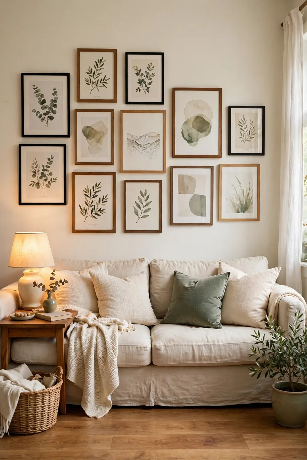
Photos hide the planning. In a finished photo you see even gaps, a calm center, and frames that relate to each other. Most messy gallery walls skip the planning step. They grow one frame at a time, each new piece filling whatever gap is left, until the spacing drifts and the center creeps upward.
Three habits cause most of the trouble: hanging frame by frame with no outer shape in mind, spacing that changes from gap to gap, and hanging too high. A frame hung at standing eye level looks fine from across the room and wrong from the sofa, where you actually sit. The fix is the same for all three: decide the outer shape first, pick one spacing number, and set the center at eye level.
What are the 7 gallery wall layouts that work in almost any room?
Seven layouts, from orderly to relaxed.
1. The grid layout
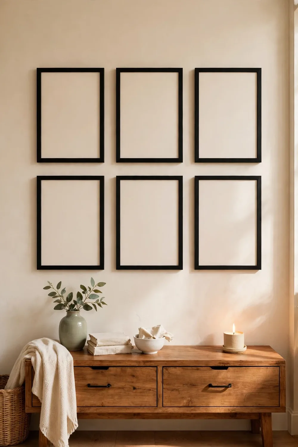
The grid is the calmest gallery wall there is. Use frames that are all the same size, hang them in straight rows and columns, and keep every gap the same, about 2 to 3 inches. A grid of six frames, three across and two down, fills the wall over a sofa or a console without ever looking busy.
Measure the outer rectangle first. Make the grid about two thirds of the width of the furniture below it, mark the corners with painter’s tape, then hang the top row first. The grid suits matching frame sets best, and it makes a strong first step in a room makeover. If your frames are different sizes, try the salon layout below instead.
2. Salon style, the loose cluster
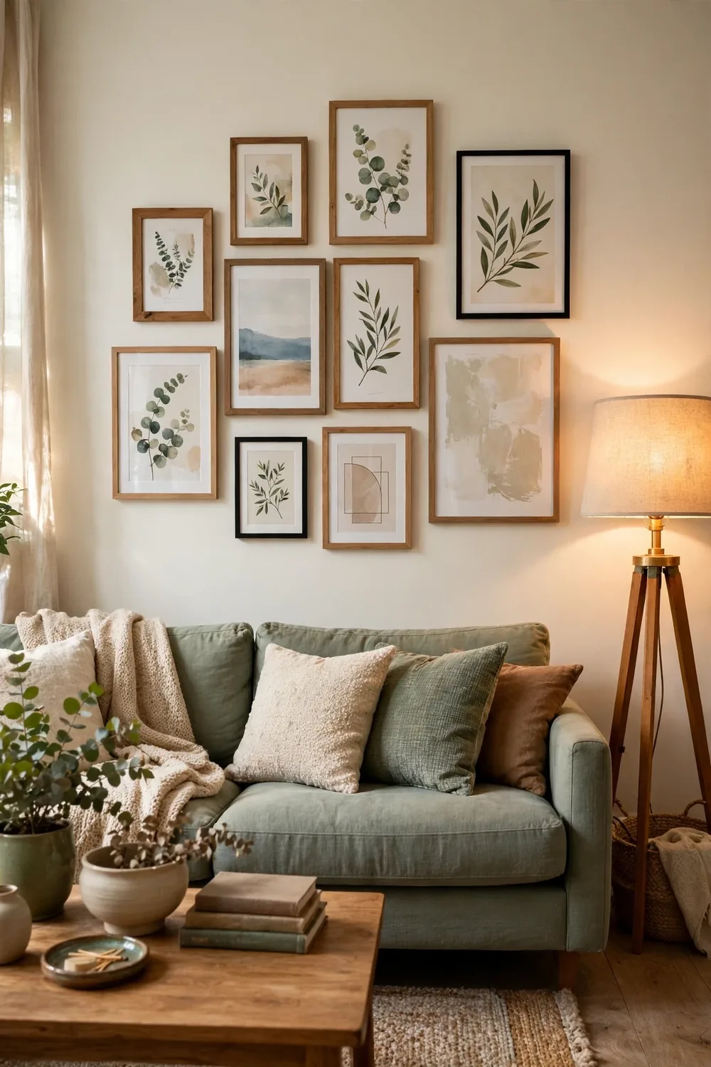
Salon style is the classic gallery wall: mixed sizes and mixed frames in a loose cluster that looks collected over time. It suits art you already own and walls where a strict grid would feel stiff. A good salon wall is not random at all. It has one anchor piece, usually the largest frame, and everything else orbits around it.
Hang the anchor first, at the center, with its middle at eye level. Add the next largest frames around it, keeping the same gap between every pair, and fill the remaining spaces with the smallest pieces last. Keep one thing consistent across the mix, the same mat color or the same wood tone, so the wall reads as collected rather than accidental.
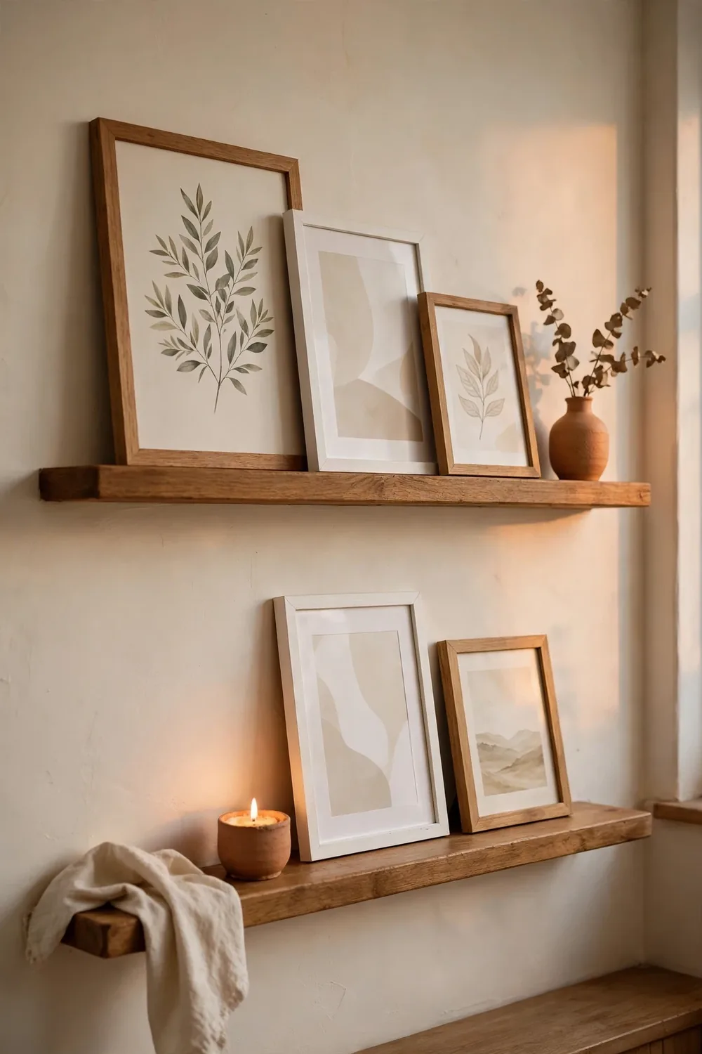
3. The ledge shelf gallery
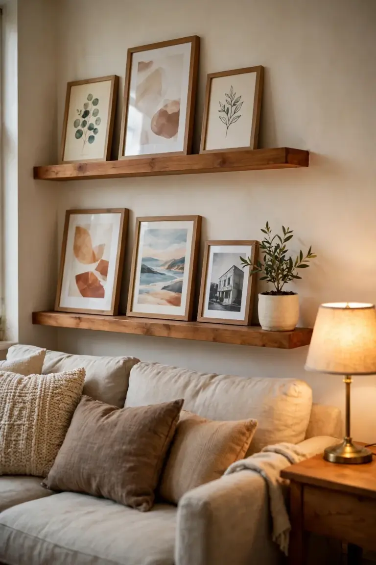
Picture ledges are the gallery wall for people who change their minds. Two or three narrow shelves hold the frames upright, leaning against the wall, so you can swap a print or restyle the whole wall in minutes without touching a nail. This is the layout to choose if you rent or if the idea of drilling holes makes you hesitate.
Hang the lowest ledge at about eye level, then space the next ledge 12 to 18 inches above it. Overlap the frames slightly, taller pieces at the back, and leave breathing room at the ends. A ledge packed edge to edge reads as storage, while a ledge with gaps reads as a display. A small print that would vanish on a big wall looks deliberate on a ledge beside a larger frame.
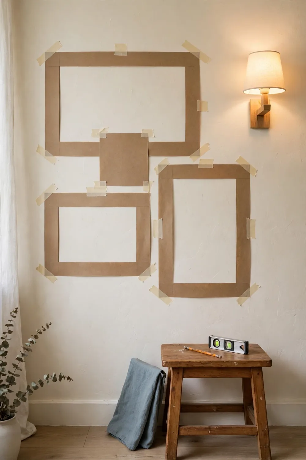
4. Plan it first with paper templates
This is the step that makes every other layout work. Trace each frame onto kraft paper, cut out the shapes, and tape them to the wall in the arrangement you want. Live with the paper version for a day and notice whether the shape feels balanced from the places you actually use the room.
Paper templates catch the mistakes that are expensive to fix after hanging: an arrangement too wide for the wall, a cluster too high, or a gap that looked fine in your head and looks wrong on the wall. When the paper version looks right, mark each nail spot through the paper, hang the frame, and peel the paper away. The template step adds about 20 minutes and saves the most common regret, a wall full of holes from guessing.
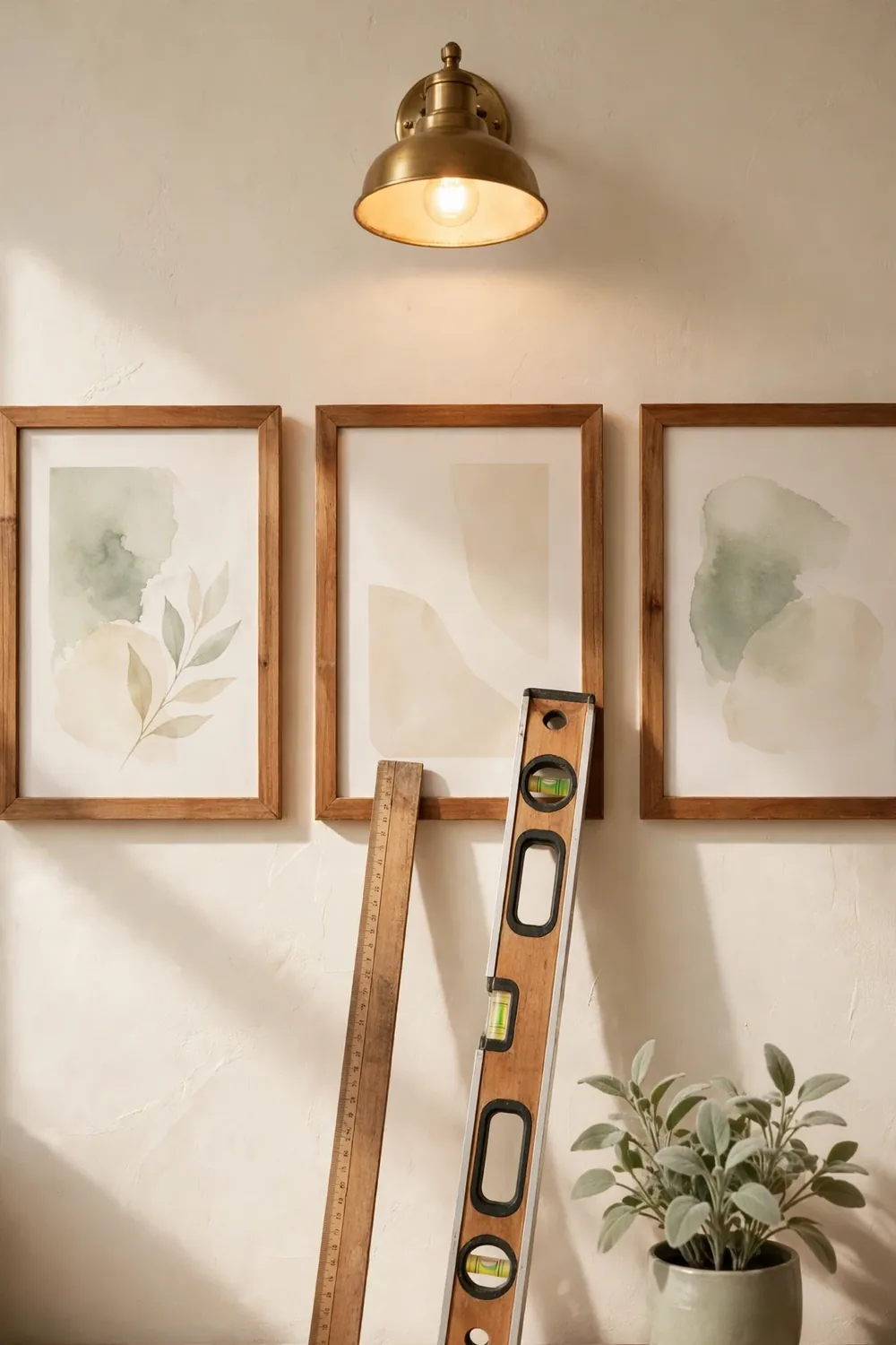
5. Measure the spacing, then hang
Spacing is the detail that separates a gallery wall that looks intentional from one that looks improvised. Pick one number, 2 inches or 3 inches, and use it for every gap. The exact number matters less than the consistency. A wall where every gap is 2 inches looks calm, while gaps that wander between 1 and 5 inches look accidental.
A simple spacer makes consistency easy: cut a small block of cardboard to your gap width and hold it between frames as you mark each nail. Hang the center frame first, then work outward in pairs, so the arrangement stays balanced as it grows. Check the whole wall from across the room after every few frames.
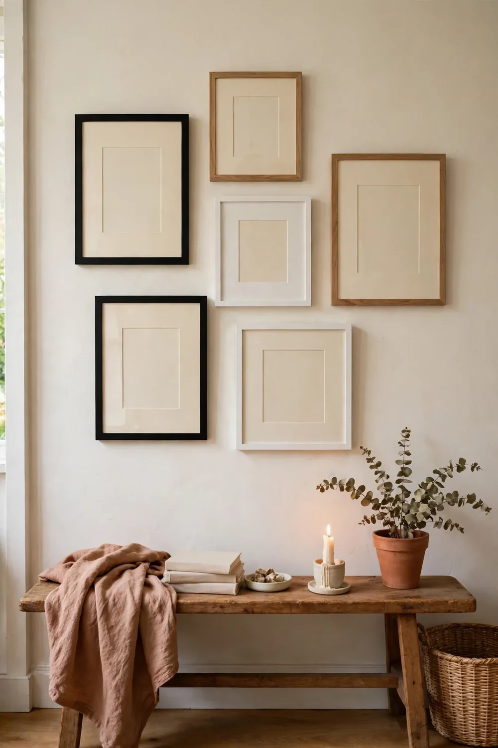
6. Mix the frames on purpose
Mixed frames look collected when the mix is deliberate, and chaotic when it is not. The rule is simple: vary one thing at a time. Vary the sizes but keep the frame color the same, or vary the colors but keep the sizes similar.
Mats are the easiest unifier. A white or cream mat inside different frames makes prints of different sizes feel like they belong together, and it gives small prints the visual weight they need beside larger pieces. Limit the palette to two or three frame finishes at most. Black plus natural wood is a classic pair, and one metallic accent can join the mix if it appears at least twice, because one lone gold frame looks like a mistake while two look like a choice.
7. The hallway gallery
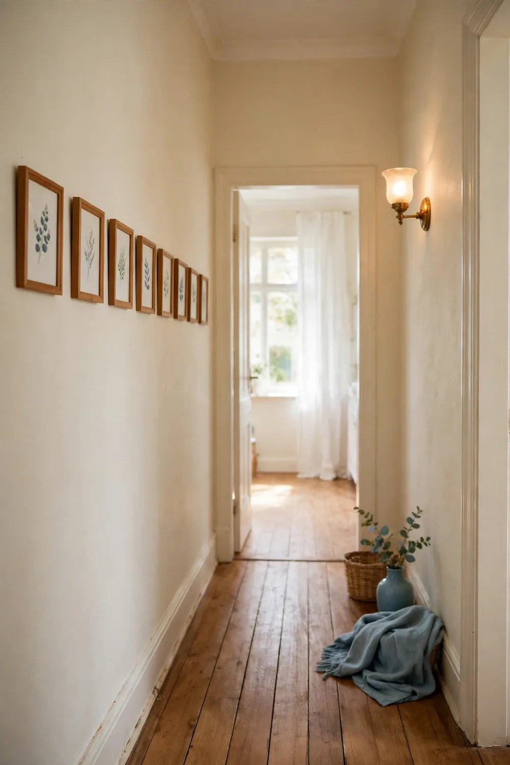
A hallway is the most forgiving gallery wall in the house and the most often wasted. The wall is long and the viewing distance is short, so a row of frames turns a passage into a place worth slowing down in. The same thinking shapes good tiny entryway ideas: one wall, one job, and nothing competing for attention.
Hang a single row at eye level, with the center of the frames about 57 to 60 inches from the floor, or run two rows if the hallway is wide enough to step back and see them. Keep the spacing tight and even, about 2 to 3 inches, because a hallway is viewed up close and uneven gaps show more here. Leave the first 12 inches beside a door frame empty, and choose slim frames.
Common mistakes
Three patterns show up in almost every disappointing gallery wall, and each one has a simple fix.
The first is hanging too high. The center ends up near the ceiling because each frame was hung at standing eye level, one after another, and the cluster drifted upward. The fix is to set the center of the whole arrangement at 57 to 60 inches from the floor before hanging anything.
The second is spacing that drifts. The first gap is 2 inches, the next is 4 inches, and by the end of the row the gaps are anyone’s guess. The fix is a spacer, a small block cut to your chosen gap width, used for every gap.
The third is frames that are too small for the wall. Four small frames on a wide wall look lost, no matter how good the art is. The fix is to size the arrangement to the wall: the whole group should span about two thirds of the width of the furniture below it. Add larger pieces or mats to give small prints more presence.
Editor’s pick
For a first gallery wall, we would choose the grid layout planned with paper templates. The grid removes the hardest decision, where each frame goes, and the templates remove the scariest part, the first holes in the wall. Together they turn a project that feels risky into one that takes about an hour and leaves no regrets.
A gallery wall is finished when the spacing looks boringly even. The even gaps are what let the art do the interesting work.
FAQ
How far apart should gallery wall frames be? About 2 to 3 inches apart, the same gap everywhere. The exact number matters less than the consistency.
How high should a gallery wall hang? Center the whole arrangement about 57 to 60 inches from the floor, measured to the middle of the group, not the top frame.
How do you plan a gallery wall without extra holes? Trace each frame onto paper, cut out the shapes, and tape them to the wall. Live with the paper version for a day, then mark each nail spot through the paper and hang the frames.
Can frame colors and sizes be mixed in one gallery wall? Yes, if you vary one thing at a time. Mix the sizes but keep the frame color the same, or mix the colors but keep the sizes similar. Matching mats also pull different frames together.
What is the easiest gallery wall for a renter? Picture ledges. The frames lean on the shelves instead of hanging from nails, so you can swap or restyle the whole wall in minutes. Hang two ledges 12 to 18 inches apart and overlap the frames slightly.
Related guides
For the room around the wall, the cozy bedroom ideas guide uses the same edit-first logic at room scale, and the bedding layering guide shows how one good layer beats three competing ones. If the wall sits in the living room, start with the small living room ideas guide.